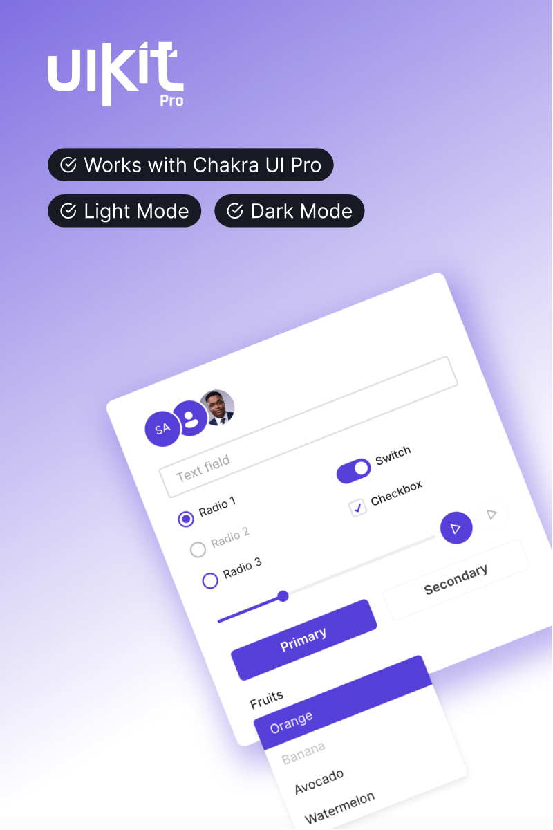
The official Chakra UI Figma Kit ⚡️
Get access to simple, modular and accessible components you need to design and build your applications.
What's Included
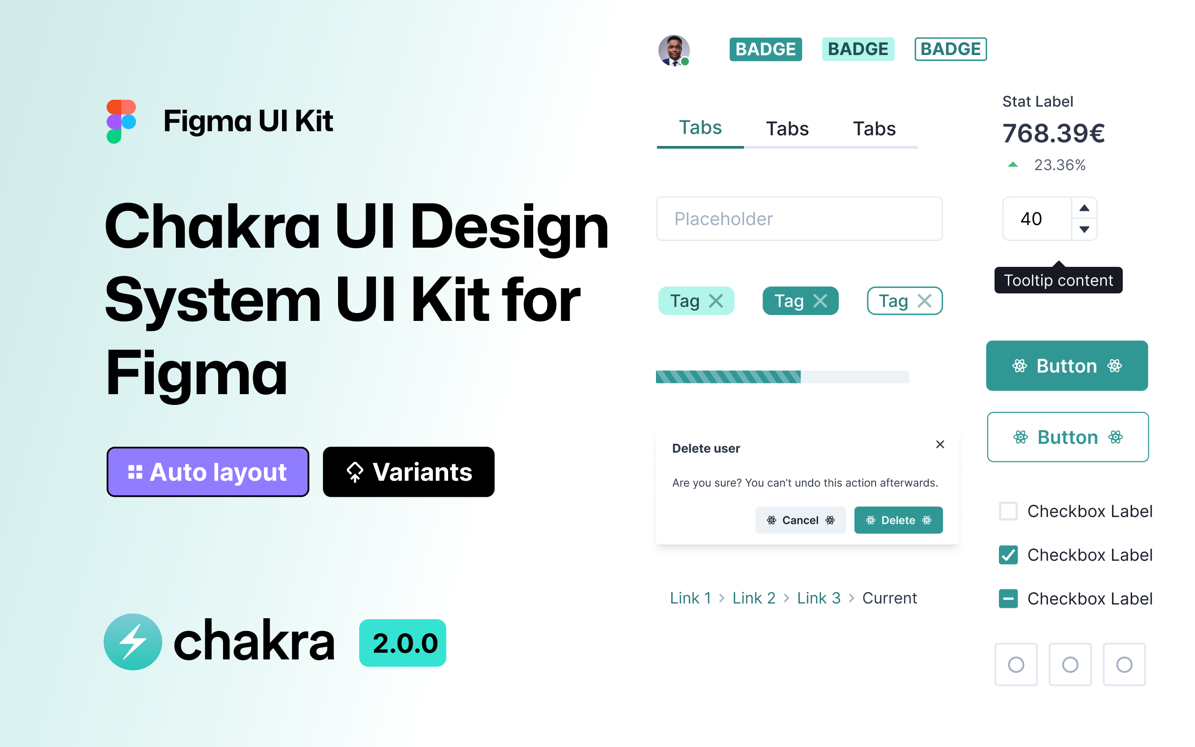
- Extensive styles for typography, color and effects
- Component variants including size and state, now also with interactions
- Dynamic layers powered by Auto Layout
- Implicit pixel grid sizes and spacing
Components
- Data Display: Badge, Close Button, Kbd, Stat, Table, Tag
- Feedback: Alert, Toast, Progress
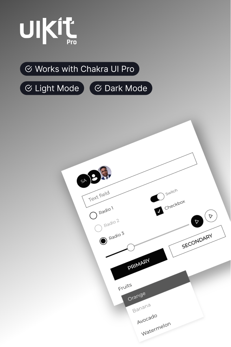
- Forms: Button, Circular Progress, Checkbox, Form Control, Icon Button, Input, Number Input, Radio, Select, Slider, Switch, Textarea
- Media and Icons: Avatar, Icon (Remix Icon)
- Navigation: Tabs
- Overlay: Alert Dialog, Dialog
All components are open source and available for production-level React applications. Learn more in our documentation.
